WiDS Datathon 2023
This year I participated in my first ever datathon, hosted by the Women in Data Science (WiDS) organization. The challenge for this year’s competition was to accurately predict daily temperatures over hundreds of regions in the United States over two months. The challenge was hosted on Kaggle. In this post, I will summarize my approach and the things I learned from participating in the datathon. I would like to sincerely thank the competition organizers, as well as all the other participants who kindly shared their Kaggle notebooks - I have cited the notebooks I read in the References section below.
Introduction
This year’s datathon gave participants a large dataset consisting of over 240 different features for 500+ unique regions inside the US, in daily increments over about 2 years [1]. The challenge was to use this dataset to predict values over a 2 month time span for the target feature [1]. The target variable was the arithmetic mean of the min and max observed temperatures over the next 2 weeks for each unique location and start date in the dataset [1].
The features in the dataset gave information about the geographical regions sampled, as well as meteorological data including temperature, precipitation, humidity, sea level pressure, wind speeds, data on significant effects like El Nino and tropical convection, etc. [1]. The dataset included both measured values as well as predictions made by a variety of existing meteorological models and ensembles, averaged daily and monthly [1].
The unique locations were characterized by normalized, anonymized latitude and longitude values, as well as by climate region labels and elevation data [1]. To help myself visualize the geographic distribution of the data, I plotted the climate region labels and elevation data as shown below in Figures 1 and 2.
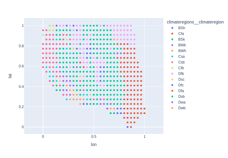
Figure 1 - Geographic distribution of climate regions in the dataset.
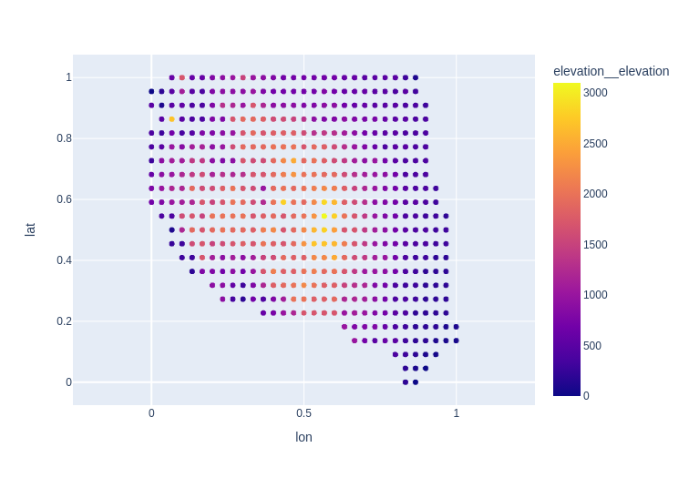
Figure 2 - Elevation data for all the unique locations sampled in the dataset.
Both the training and test datasets contained the same features - with the exception that the test dataset did not contain the target feature values [1]. But this meant that we could train models to make predictions using the other features because we had their values for the target time range - this was helpful because it meant we did not have to create our own additional features for the target time range by creating lagged values.
For this challenge, I relied heavily on several Python libraries including Pandas, plotly, statsmodels, sklearn and Microsoft’s implementation of a light gradient-boosting model, lightgbm. I have included links to my Kaggle notebooks where applicable.
The overall outline of my approach to this datathon can be summarized as:
- Examine the raw data and impute missing values.
- Perform an exploratory data analysis, looking for patterns and features with strong correlations to the target variable.
- Establish a baseline predictive approach using ARIMA.
- Use feature engineering to generate additional features conveying useful time-related information.
- Apply a machine learning solution to try to beat my baseline approach, primarily LightGBM [5].
Examine the Raw Data and Impute Missing Values
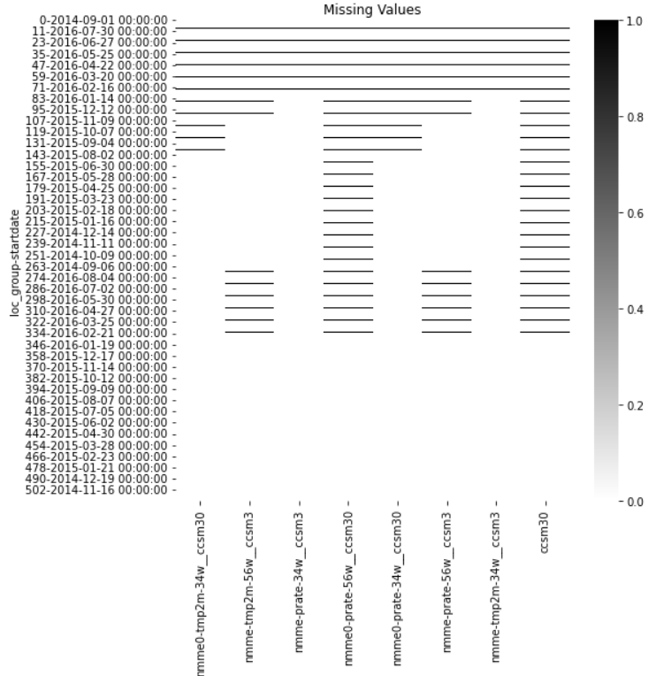
Figure 3 - Visualized missing values in the training dataset.
The Kaggle notebook for my data intake process is available here.
I found that there were 8 features which were missing values, as visualized in Figure 3. These features contained predictions of temperature and precipitation from the North American Multi-Model Ensemble forecast model, which is a “is a collection of physics-based forecast models from various modeling centers in North America” according to the datathon’s data page [1]. I noted that some of the predictions were monthly mean predictions, while others were daily mean predictions. An example of the daily and monthly predictions for the observed temperature from the CCSM3 model for (latitude, longitude) = (0, 0.84) taken from the training dataset are shown below in Figures 4-5. In both cases, I decided to use the forward-fill method to impute the missing values since precipitation and temperature are strongly correlated with previous days/months.
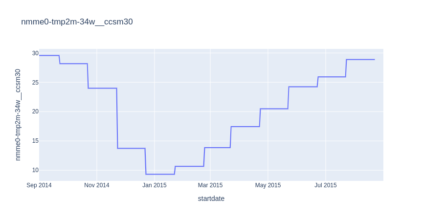
Figure 4 - Monthly NMME model forecasts for the target label using the CCSM3 model.
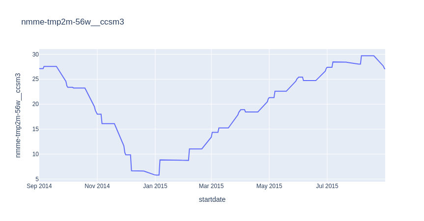
Figure 5 - Weighted average of monthly NMME model forecasts for the target variable using the CCSM3 model.
One useful insight from this step was that the target time period did not immediately follow the training data. The training data ranged from 1 Sept 2014 to 31 Aug 2016, but the test data ran from 1 Nov 2022 to 31 Dec 2022. In total, there was a gap of 4 years, 2 months between the train and test datasets. This made generating a baseline more challenging, as we will see below.
Perform an EDA
The Kaggle notebook for my EDA is available here.
In my EDA, I focused on trying to understand how the data was organized across geographic regions, and then I did a deep dive into the data for one location to see if I could find correlations between any of the features and the target feature. My reasoning was that the same features (which include data on the geographic region as well as various meteorological measures like temperature, precipitation, wind speeds, humidity, etc.) would correlate strongly with the target variable regardless of the geographic region.
I first looked at the distribution of climate regions in the data, and found that the 3 categories that were most common in the dataset were cold, semi-arid climates (“BSk”), warm-summer humid continental climates (“Dfb”) and humid, subtropical climates (“Cfa”). Conversely, the 3 least frequently appearing regions were Mediterranean-influence subarctic climates (“Dsc”), Monsoon-influenced hot-summer humid continental climate (“Dwa”) and Monsoon-influenced warm-summer humid continental climate (“Dwb”). This distribution is shown in Figure 6, and if we also look back at Figure 1, we can see that this distribution corresponds to the graphical representation. It appears, for example, that the most common “BSk” region (cold, semi-arid climate) appears in regions that likely are near the Rocky Mountains as well as mountain ranges in the eastern US. And on the other end of the distribution, the “Dwb” regions (monsoon-influenced warm-summer humid continental climate) only appear in the southern part of the country, closer to the Equator and the Gulf.
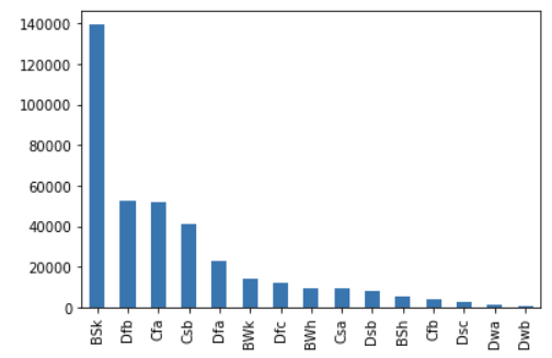
Figure 6 - Plot of frequency of each climate region label appearing in the training dataset.
Given that the cold, semi-arid climate (“BSk”) was the most frequently appearing category in the dataset, I selected a single location from that category for my deep dive into the available features. As stated in the Introduction, the dataset includes a wide variety of meteorological data. I noticed that there were many different features containing similar forms of data - for example, there were many temperature predictions from a range of models within the NMME ensemble, averaged over varying lengths of time. While the relationship between the target variable and the other features would likely depend somewhat on the frequency of the feature (i.e. if it varied daily, monthly or over some other period), I hypothesized that the general relationship between different types of meteorological data and the target variable would be relatively constant. That is, I hypothesized that all the temperature data would have similar amounts of correlation to the target variable when compared with the correlation between all the wind speed data and the target variable, for example. This is by no means a proven hypothesis, but it was a reasonable starting point to guide an in-depth analysis of some of the key features, since exploring all 240 would be prohibitively time-consuming. Instead, I selected 14 key features from the dataset, as well as the target variable, which broadly represented all the categories of data available in my dataset. A complete list of variables that I examined, along with a description, is available in my Kaggle notebook.
I began my deep dive by plotting a correlation matrix for these 14 key features and the target variable. Note that computing correlation for time series data is a little different than for other data types - I reviewed several common correlation methods and how they are applied to time series data in this blog post. For the correlation matrix shown in Figure 7, I used the Pearson correlation coefficient.
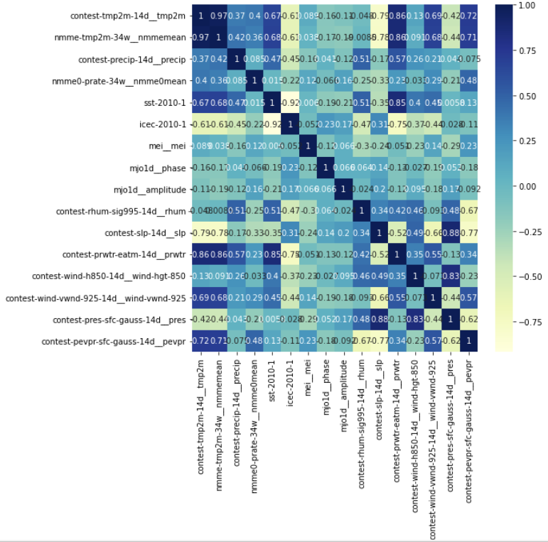
Figure 7 - Correlation matrix (using Pearson correlation coefficient) for 14 key features and target variable.
When we examine this correlation matrix, we can see that the features most highly correlated with the target variable (“contest-tmp2m-14d__tmp2m”) are the NMME model mean prediction of the temperature (“nmme-tmp2m-34w__nmmemean”), the precipitable water prediction (“contest-prwtr-eatm-14d”), and the potential evaporation (“contest-pevpr-sfc-gauss-14d”). The sea level pressure (“contest-slp-14d”) was also highly negatively correlated with the target variable. For contrast, some of the data with the least correlation was the Madden-Julian oscillation period and amplitude, which measure tropical convection (“mjo1d__phase” and “mjo1d__amplitude”). To visually confirm that these correlations were possible, I plotted the target variable against the feature in question as shown in Figures 8 - 11 below (the target variable is always plotted on the secondary y-axis in red).
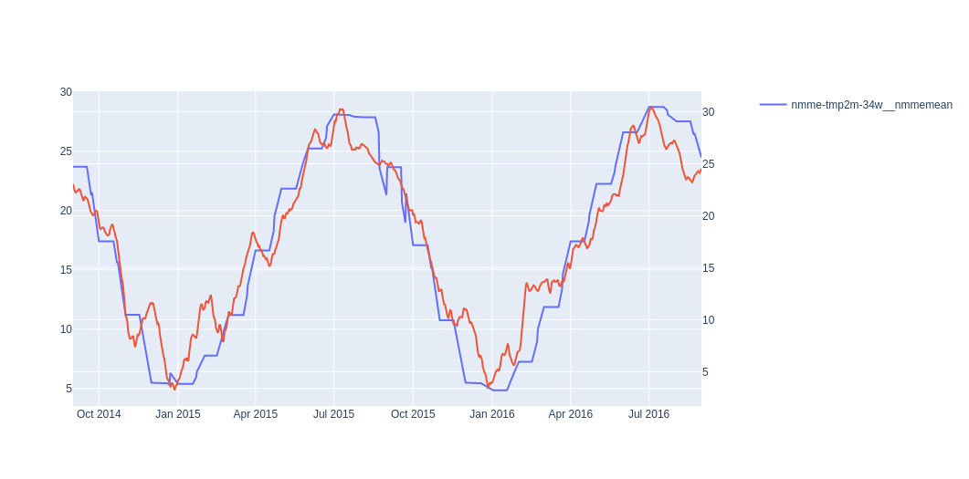
Figure 8 - NMME mean temperature prediction compared to target variable.
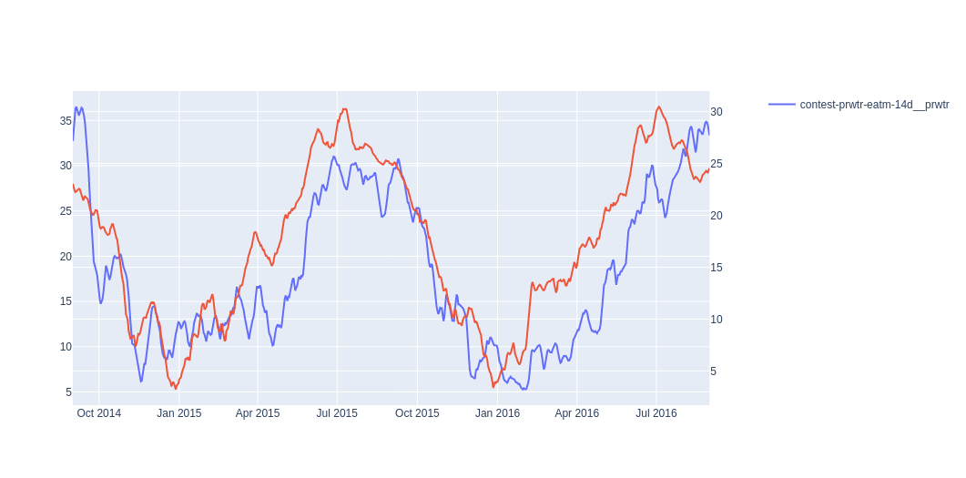
Figure 9 - Precipitable water predictions compared to target variable.
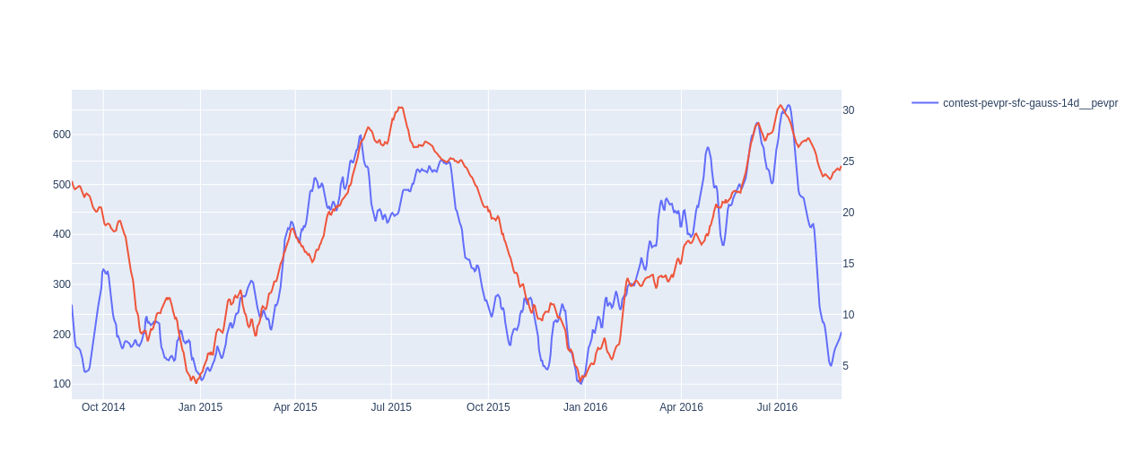
Figure 10 - Potential evaporation plotted against target variable.
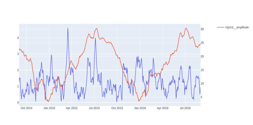
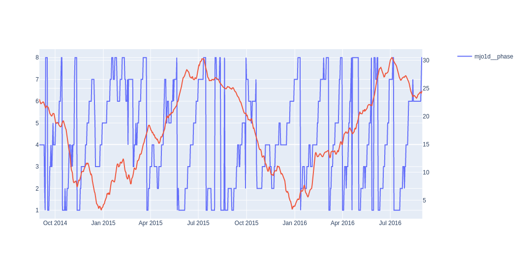
Figure 11 - The Madden-Julian oscillation phase and amplitude plotted against the target variable.
After looking at the raw time series data for these highly correlated features, I wanted to understand if they also shared similarities if we decomposed them into trends and seasonalities (I write about these concepts here). I used the statsmodels seasonal_decompose function to divide the target variable and my three highly correlated features into trends, seasonalities and residuals. I used an additive model and a period of 365 days (one year) because I know that temperatures tend to follow patterns that repeat on a yearly basis.
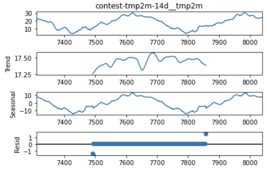
Figure 12 - Results of seasonal decomposition for target variable.
As we can see from Figure 12, the target variable does not have a strong trend component - this suggests that the temperature range was fairly constant over the time period for which we have data. Most of the target variable’s variation is contained in the seasonal component, indicating that the temperature is varying following a consistent pattern year over year. The residuals are zero indicating that this method was not able to separate out random variation from the trend and seasonal components. Now let’s look at how our highly correlated variables compare.
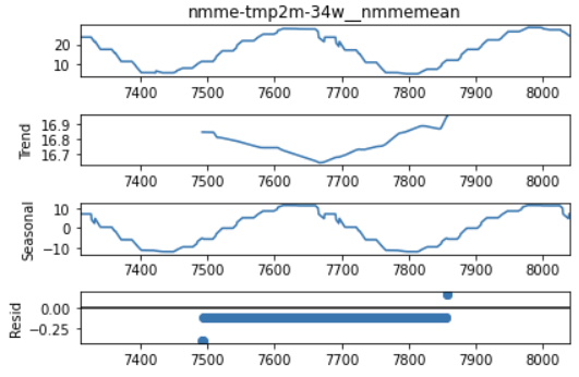
Figure 13 - Results of seasonal decomposition for NMME mean temperature prediction.
Here we can see that the NMME’s mean temperature forecast is very similar to the target variable in that there is also not a strong trend (i.e. the temperature cycles consistently year to year without showing a strong increase or decrease). The NMME forecast also has a strong seasonal component that matches the pattern of the target variable. This key feature has a consistently small, negative residual but that could just be an indication that the model fit has a slight DC offset from the actual data.
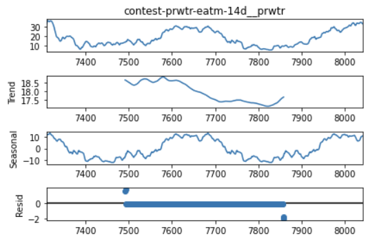
Figure 14 - Seasonal decomposition for precipitable water predictions.
The precipitable water prediction does differ slightly from the target variable because we see signs of a more significant downward trend in the precipitable water values over the two years of data. However, the precipitable water prediction also has a strong seasonal component that, again, matches the target variable - this commonality is probably the primary reason for why the two features were found to be strongly correlated. Again, the residuals for this feature are zero.
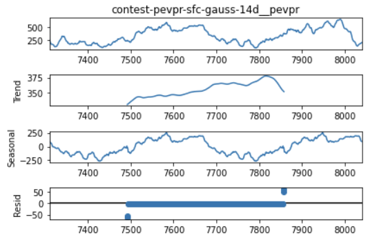
Figure 15 - Seasonal decomposition for potential evaporation.
The potential evaporation predictions also show a strong trend component, this time in the positive direction. It is possible that the trends do not seem to influence the Pearson correlation coefficient very strongly because we do not have a large enough time window in our data to really see the trend come into play - if we were looking at, say, a decade’s worth of data, it might reduce the correlation between this feature and the target more strongly. In contrast, the strong seasonal component that closely matches the target’s pattern is likely the driving factor behind the high correlation scores for this feature and the target.
We have almost wrapped up the EDA portion of this project, but before I stopped, I also wanted to take a closer look at the distribution of the target variable over all of the data (and not just for one location). I generated a violin plot of the target variable by region for the entire time period because I wanted to see if there were a lot of outliers in the target feature. Outliers can make it harder to generate good predictions with a model, so I wanted to get a sense of how difficult the task ahead was going to be. As we can see from the plot below, several of the climate regions showed outliers but most of these regions fell into the mid- to low-range in terms of their frequency in the dataset, suggesting that they will not make my job as a forecaster significantly more difficult because they will not appear very often.
Now let’s move on to setting up some baselines to see if that will turn out to be the case!
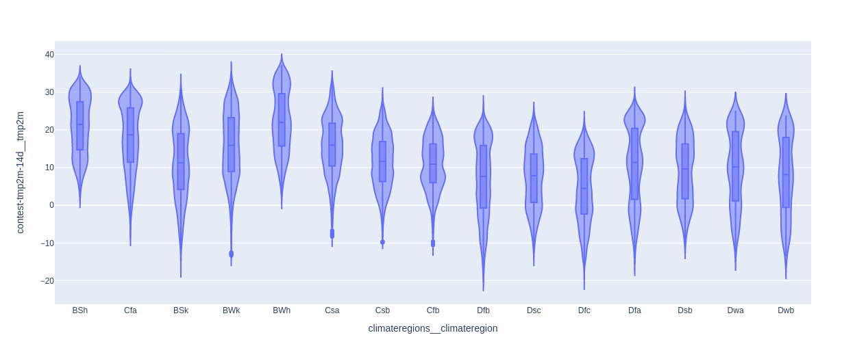
Figure 16 - Violin plot of target variable divided by region over entire time period of training dataset.
Establish a Baseline with ARIMA
The Kaggle notebook with my ARIMA model is available here.
I chose the ARIMA model as my baseline because I wanted to establish what I hoped would be a challenging baseline to surpass with a machine learning model. Some commonly used baseline forecasting models - such as the naive method (using the last value) or using the mean - are not appropriate for predicting two months into the future [7]. The ARIMA model includes terms that can capture several aspects of the time series (see my blog post for more details) and so make it one of the most adaptable non-ML predictive models available.
There are some drawbacks to using ARIMA, however, The first is that it is designed to be used only on the target feature, and so I cannot leverage any of the other features in the dataset to help make predictions. Secondly, the datathon challenges participants to predict mean temperatures in 2020, but the training data ends in 2016, which is bad for using ARIMA because typically you want to use ARIMA to predict the immediate next points in the time series.
To adapt to this separation between train and test time windows, I use training data up to 31 October 2015, and then make predictions for the next 61 days in 2015 and assume that they are also suitable predictions for 2020. Given what we learned about the target variable in my EDA, we saw that there was not a significant trend in the target over the 2 years of data in our training dataset. However, as we noted in that discussion, two years may not be a wide enough window to see a strong year over year trend emerge. It is possible that the temperatures observed in 2020 are significantly warmer or colder than those we saw in 2014 - 2016, and so that approach may not be very accurate.
Another challenge with using ARIMA is that we must fit the ARIMA model to data from 514 unique geographical locations, as described above. This will mean that optimal model parameters for one region may not be optimal for another region.
Okay, now that we’ve considered some of the issues we’ll have to address with using ARIMA, let’s set it up. First, I need to choose parameters p, q and d for the model - they determine the autoregression (p), moving average (q) and integration order (d) for the model. Typically, we can look at the autocorrelation of the time series to choose our q value and the partial autocorrelation to choose the p value, and then select a d value that minimizes the prediction error after p and q are chosen. Since we have 514 unique regions and thus 514 time series we need to consider, I chose one time series for each of the 3 most frequently appearing climate regions to use as data for fitting our model.
I computed both the autocorrelation and partial autocorrelation for one of these locations, as shown in Figures 17 - 19 below. As we can see in Figure 17, the plot shows that there is always a strong correlation between the current time point and previous time points over an entire year’s worth of data. This makes it more difficult to identify a particular value of q that will fit the data well.
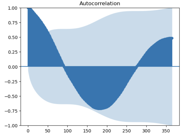
Figure 17 - Autocorrelation over the previous 365 days for location 10, target variable.
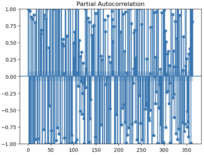
Figure 18 - Partial autocorrelation for location 10 over the previous 365 days.
Similarly, in Figure 18, we also saw that there was consistently a strong partial autocorrelation between the current time point and individual previous time points, although the correlation more frequently alternated between positive and negative over the year-long window we examined. To try to find a pattern in the shorter term, we also plotted the partial autocorrelation over the last 50 days in Figure 19.
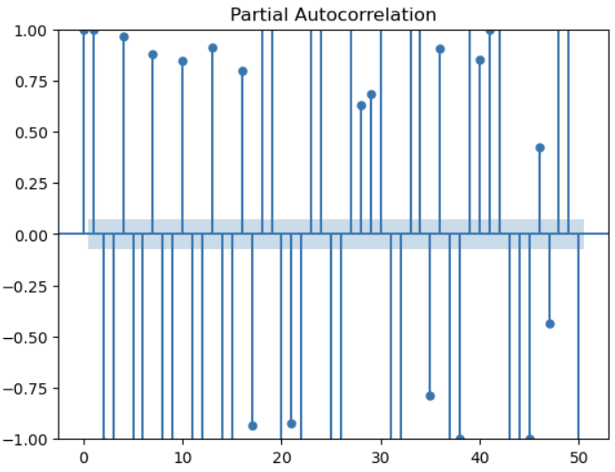
Figure 19 - Partial autocorrelation for location 10 over the previous 50 days.
As we can see, there is still not a strong pattern over the previous 50 days. Overall this method has not really helped us to select good values of p and q. My next approach is to conduct a more traditional hyperparameter sweep varying the values of p, q and d for my 3 chosen locations. I tested values of 1 and 7 (a day and a week) for p, q, and d in all the possible combinations. I used an expanding window validation strategy to compute the model prediction error (using RMSE) over expanding periods of time selected from my training dataset [5]. I used the fitted models to predict the next 14 days for each fold in the expanding window strategy. (Thanks very much to Leonie for demonstrating how to implement a hyperparameter sweep with an expanding window in code [5].)
I found that values of (p, q, d) = (1, 1, 7) worked the best for 2 out of my 3 sample regions, so I selected that parameter set for my ARIMA model. Note that “best” in this situation means that these parameters minimized the mean RMSE computed over all the windows in the expanding window validation. The fitted ARIMA model predictions over 14 days for each of my 3 sample regions are shown in Figures 20 - 22 below. We can see that, while the model worked quite well for locations 1 and 10, the model was grossly wrong for location 139.
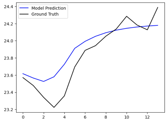
Figure 20 - Location 10 prediction with fitted ARIMA model for next 14 days.
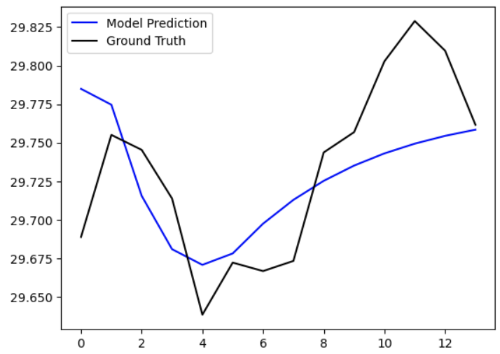
Figure 21 - Location 1 prediction with fitted ARIMA model for next 14 days.
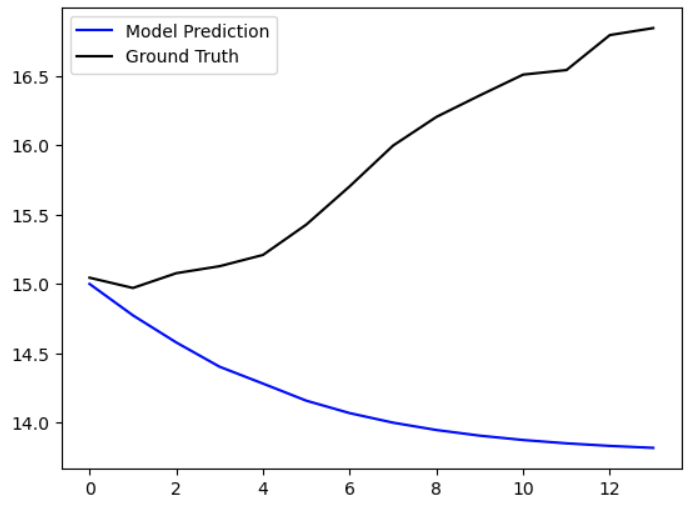
Figure 22 - Location 139 prediction with fitted ARIMA model over the next 14 days.
Using this set of hyperparameters, I fit an ARIMA model to all the data leading up 31 October 2015 for each of the unique 514 locations, and then generated predictions for the next 61 days. I collated these and submitted them to the datathon to obtain the RMSE against the full test dataset. I obtained an RMSE score of 8.817, which is pretty terrible compared to the winning submissions which had scores around 0.6. So overall my ARIMA approach was a very rough baseline, and in the next sections we will try to improve on it using an ML model.
Feature Engineering
The Kaggle notebook for my feature engineering work is available here. Many thanks to Leonie for sharing her tutorial on the topic [5].
While reading through Leonie’s tutorial on how to use the LightGBM framework (see next section), I noticed that she created a number of additional features for the training and test datasets [5]. I was confused why she would need to create additional features at first because, to be honest, there seemed to be so much data available already that I did not understand why additional features would be necessary. But after doing a bit more research, it appears that there are at least two reasons why we would want to use feature engineering to create several specific additional features for time series predictions.
Data Drift
The first reason why additional features can be helpful is due to a phenomenon known as data drift [8]. The basic definition of data drift is when data used to train a model is different in some way from the data used to validate/test the model [8]. We see this a lot in time series when, for example, the training data is from a different season than the test data, or when there is a strong trend in the data that makes past data in the series very different from future time points [8]. Drift can also be apparent in differences in geographic region, where we can expect that the ranges of values and the patterns we see may be very different for different climate regions or different hemispheres [8].
As we can see, I did not look for evidence of data drift during my EDA (lessons learned for the future!) so I cannot be sure that this phenomenon is present in the dataset. But, if we assume that it is at least possible that there is some drift, then we will need to address it. If we were in a production setting, we would want to frequently re-train the model as we acquired new data so that the model is more likely to accurately predict future values.
For us as participants in a datathon with a fixed dataset, we can take another approach, which is to encode information about the time points for the data we have to help the model identify and use seasonal/cyclical/trend patterns in the data for future predictions. These additional features may make the model more robust. We call this process periodic feature engineering and we’ll discuss it in more detail below.
Discontinuities
Another reason why we may want to create additional features related to time has to do with discontinuities in the regular datetime data type. If we use raw (ordinal) values for the day or hour, for example, there are discontinuities at, for example, the end of a day, the end of a month and the end of a year [9]. (For example, we go from the 23rd hour to the 0th hour, or the 31st day to the 1st day, etc.) These discontinuities in the inputs can lead to discontinuities (like spikes or troughs) in the output predictions of the model [9].
To address this issue, we can create more continuous representations of these times using several strategies. For example, we can encode hours in a day into a sine and cosine wave, where one period of the wave is equal to 24 hours in a day [9]. That way, the 23rd hour at the end of one day flows smoothly into the 0th hour at the start of the next day. For this dataset, we generate sine and cosine encodings for the day, week, month, quarter and season corresponding to each sample in the dataset [5, 9].
Using LightGBM to Predict Target Variable
The Kaggle notebook for the LightGBM implementation is available here. Many thanks to Leonie for sharing her tutorial on the topic [5].
I chose to use the light gradient-boosting machine (LGBM) as my ML model. An LGBM is a free and open-source gradient-boosting framework that was developed by Microsoft [10]. The framework is based on a decision tree architecture and uses a lot of the same speed-ups as were provided by XGBoost [10]. I chose this model for several reasons. The first is that I wanted a tree-based model because they have good explainability (you can see where the model chose to create decision nodes within the dataset, as we’ll demonstrate below). Secondly, I liked that LGBMs leveraged a lot of the benefits of XGBoost*1, which include implementation-level details like sparse matrix optimization, the ability to do parallel training, etc. [10]. And thirdly, LGBMs have been very competitive in recent years in various time series prediction competitions [5] which makes them an optimal choice for this datathon.
To train my LGBM, I used the same expanding window validation strategy that I used to test my ARIMA model [5]. I chose relatively standard parameters for the model, and if I had had more time I would have performed hyperparameter tuning to optimize them. For the purposes of comparing the LGBM to ARIMA, however, I will show the results of testing my default model constructed with a maximum of 32 leaves and a max depth of 8 levels [5, 11]. I set the feature fraction to 50%, meaning that the algorithm can randomly select 50% of the training features to build the decision tree [5, 11]. I used a learning rate of 0.1, 1000 gradient boosting iterations and an early stopping condition to end training after 100 rounds if the validation RMSE does not improve in that time [5, 11].
The model reported a final validation RMSE of 0.94 and a final RMSE on the training data of 0.39, suggesting that the model had overfit to the dataset. (We will get the model’s final performance on the full test dataset for direct comparison with the ARIMA model shortly.)
I wanted to get a sense of how well my model was performing in the best and worst case so I plotted the model prediction against the validation data (ground truth). As you can see in Figure 23, my best case prediction (for location 33) was very close to the ground truth. Conversely, in Figure 24, the worst case prediction (for location 182) was pretty far off, but actually not as bad as my worst ARIMA model predictions. I say this because my prediction at least captured a similar trend and even predicted a small dip in the data – my ARIMA models could generate predictions going in completely the opposite direction to the ground truth.
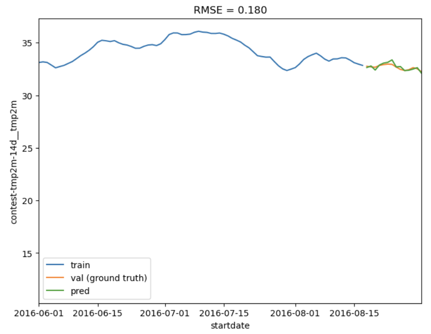
Figure 23 - Best LGBM prediction for location 33 over 14 days.
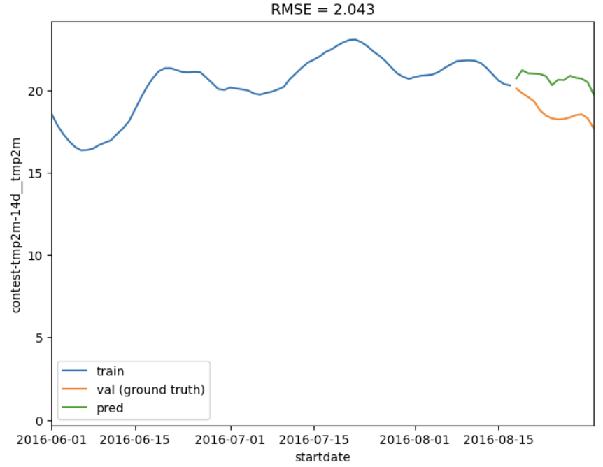
Figure 24 - Worst LGBM prediction for location 182 over next 14 days.
But there is even more to uncover with the LGBM model I trained, thanks to the explainability of decision tree architectures. I generated a plot of feature importance because I wanted to see if the LGBM used a lot of the features that I had found had the strongest correlations with the target variable during my EDA. Before discussing the results, however, I want to point out that since I set the feature fraction to 50%, it is possible that some of the features in the dataset were not included in model training, and since this is not an ensemble model, there was never a moment during training when the decision tree was exposed to 100% of the available features.
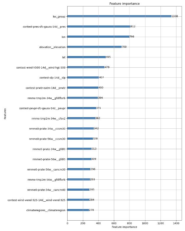
Figure 25 - Top 20 most important features in my trained LGBM.
As we can see in Figure 25, the sea level pressure (“contest-slp-14d”), precipitable water prediction (“contest-prwtr-eatm-14d”) and potential evaporation (“contest-pevpr-sfc-gauss-14d”) were all high-ranking features in the LGBM model. The NMME model mean prediction of temperature for 3-4 weeks was also highly ranked, although my LGBM model used the value generated by a different model in the ensemble than the mean over the entire ensemble, which we considered in the EDA. Nevertheless, I think this is a confirmation that our EDA’s predictions about which features would be important were accurate.
The implementation of the LGBM model also allows for plotting the tree itself to review the final architecture and how the decision nodes were arranged. In Figure 26, we can see that the first two levels were dominated by dividing the data around temperatures (the first level splits the data around 9.785 degrees C and the second levels further split these subsets). The potential evaporation feature is incorporated at the third level, and then the other features of interest are incorporated at the 4th through 6th levels. (A note for the curious: the leaf nodes are labeled with a single value which indicates the predicted value for data points that fall into that leaf – the value corresponds to the feature in the parent node [12].)
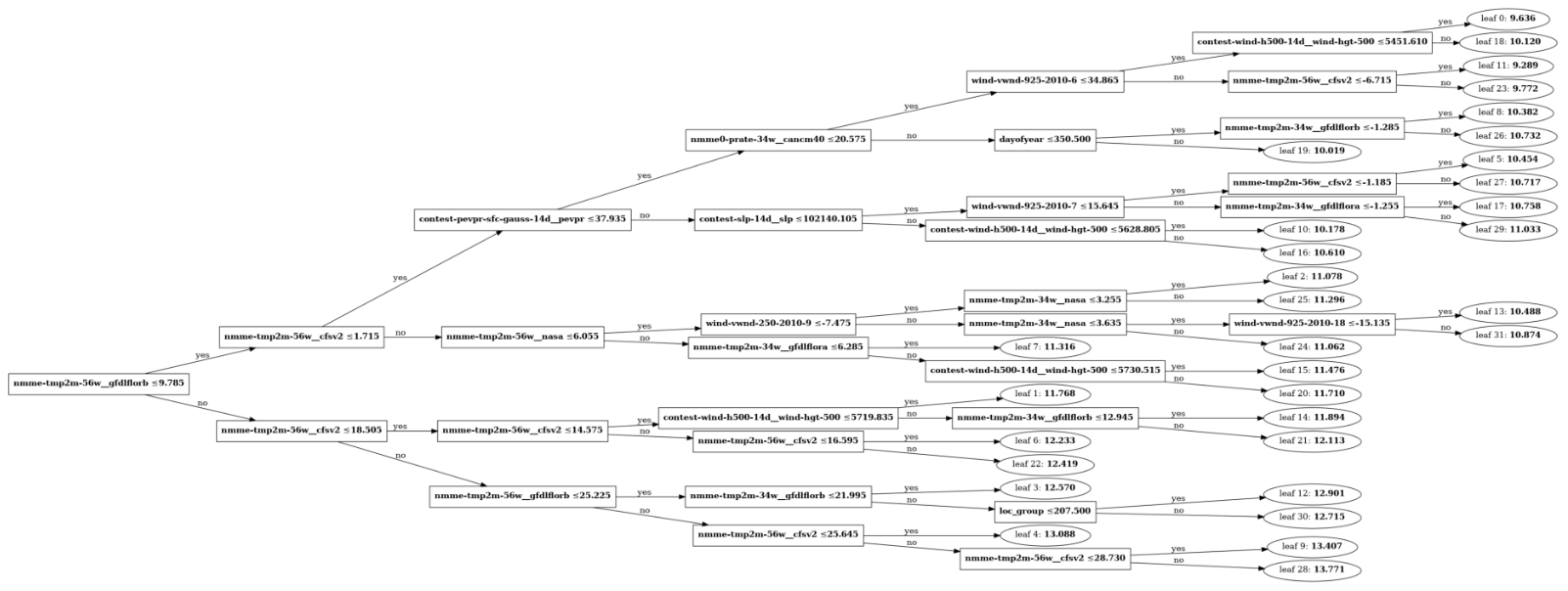
Figure 26 - Schematic of LGBM structure with all decision nodes and leaves shown.
Finally, how did our LGBM model compare to our ARIMA model? My final RMSE score was 1.53, compared to 8.815 with ARIMA. This error is still about 3X larger than the winning models for the datathon, but it shows a good improvement over ARIMA, and that’s without any hyperparameter tuning.
Conclusion
Thank you so much for reading my summary of my work on the WiDS 2023 Datathon. I feel like I barely scratched the surface of what it is possible to do with this dataset and all of the ML models available, but I also learned a lot from the things I did try. I may continue to iterate on this project in the future and try more models to see how they perform, and if I can get closer to the winning submissions.
Footnotes
*1 One of the creators of XGBoost, Tianqi Chen, also teaches the Deep Learning Systems course at CMU. I took the class and it was an incredible introduction to the mechanics underlying the implementation of PyTorch for both CPU and CUDA architectures. After taking the class, I have a much greater appreciation for the importance of having a deep level of familiarity with the implementation of machine learning algorithms. I would highly recommend the course, which is also freely available online.
References
[1] WiDS Datathon 2023. “Adapting to Climate Change by Improving Extreme Weather Forecasts: Dataset Description.” https://www.kaggle.com/competitions/widsdatathon2023/data Visited 11 Mar 2023.
[2] Linh, N. and Anh, V. “EDA, time series and climate regions analysis.” WiDS Datathon 2023. https://www.kaggle.com/code/linhnguyn555/eda-time-series-and-climate-regions-analysis Visited 11 Mar 2023.
[3] Samaha, K. “EDA, WiDS Datathon-2023.” WiDS Datathon 2023. https://www.kaggle.com/code/khsamaha/eda-wids-datathon-2023 Visited 11 Mar 2023.
[4] Gunathilake, A. “WiDS Datathon 2023_Extreme Weather Forecasts.” WiDS Datathon 2023. https://www.kaggle.com/code/anjanagunathilake/wids-datathon-2023-extreme-weather-forecasts?scriptVersionId=119974583 Visited 11 Mar 2023.
[5] Leonie. “WiDS Datathon 2023: Forecasting with LGBM.” WiDS Datathon 2023. https://www.kaggle.com/code/iamleonie/wids-datathon-2023-forecasting-with-lgbm Visited 11 Mar 2023.
[6] Felicioni, F. “WiDS 2023: different locations train/test SOLVED.” WiDS Datathon 2023. https://www.kaggle.com/code/flaviafelicioni/wids-2023-different-locations-train-test-solved Visited 11 Mar 2023.
[7] Hyndman, R. J., Athanasopoulos, G. Forecasting: Principles and Practice, 2nd. Ed. 2018. https://otexts.com/fpp2/ Visited 12 Mar 2023.
[8] Cheung, R., Datta, T., Massa, H., Ostermeier, S. “Data Drift for Dynamic Forecasts: An Arthur tutorial for the 2023 WiDS Datathon.” https://colab.research.google.com/drive/10r73mOp1R7cORfeuP97V65a-rgwGyfWr?usp=sharing#scrollTo=_UCopoHTKKag Visited 12 Mar 2023.
[9] “Time-related feature engineering.” scikit-learn.org. https://scikit-learn.org/stable/auto_examples/applications/plot_cyclical_feature_engineering.html Visited 12 Mar 2023.
[10] “LightGBM.” Wikipedia. https://en.wikipedia.org/wiki/LightGBM Visited 12 Mar 2023.
[11] “Parameters.” LightGBM. Microsoft Corporation, 2023. https://lightgbm.readthedocs.io/en/latest/Parameters.html Visited 12 Mar 2023.
[12] “lightgbm.plot_tree.” LightGBM. Microsoft Corporation, 2023. https://lightgbm.readthedocs.io/en/latest/pythonapi/lightgbm.plot_tree.html Visited 12 Mar 2023.
